Wednesday 6 April 2011

Bus Stop Poster

I have noticed that many films have adverts on the sides of buses and at bus stops. This prompted me to experiment with my poster and put it into a photograph of a bus shelter where there is an advertisement board. 


          ----------->  


Using Adobe Photoshop, I have created the image that you see above. 

Saturday 2 April 2011

Evaluation Powerpoint Video

After writing up my evaluation, I transferred it to a powerpoint presentation before converting that into a YouTube video which can be seen below. 


EVALUATION: How did you use media technologies in the construction and research, planning and evaluation stages?

Final Cut Express 
Final Cut Express is a non-linear video editing application created by Apple Inc. It is the consumer version of Final Cut Pro and is designed for advanced editing of digital video as well as high-definition video, which is used by many amateur and professional videographers. Final Cut Express is considered a step above iMovie in terms of capabilities, but a step underneath Final Cut Pro and its suite of applications.  
I found Final Cut Express a complex piece of software to understand initially. Gradually, however, as I experimented more and more with different parts of the programme, I became more adept at using it to create the effects that I desired. 

Adobe In Design

Adobe In Design is a software application produced by Adobe Systems. It can be used to create works such as posters, flyers, brochures, magazines, newspapers and books. In conjunction with Adobe Digital Publishing Suite In Design can publish content suitable for tablet devices. Designers and graphics production artists are the principal users, creating and laying out periodical publications, posters, and print media. It also supports export to EPUB and SWF formats to create digital publications, and content suitable for consumption on tablet computer devices. The Adobe In Copy word processor uses the same formatting engine as In Design.  

Having had previous experience of using In Design, I was confident of creating my two ancillary tasks on this Software. As a result of this previous experience, I am very pleased with both my ancillary projects.

Adobe Photoshop
Adobe Photoshop is a graphics editing program developed and published by Adobe Systems Incorporated.
I created the image of the eye using Photoshop. I used the image of the house, cropped it and inserted it into the pupil of the eye. Although I had limited knowledge and experience of using photoshop, I feel that my goal was achieved well.  You can see my finished piece to the right. 

iTunes
iTunes is a proprietary digital media player application, used for playing and organizing digital music and video files. The application is also an interface to manage the contents on Apple's iPod and iPhone lines, as well as the iPad. iTunes can connect to the iTunes Store to purchase and download music, music videos, television shows, iPod Games, Audiobooks, Podcasts, movies and movie rentals (not available in all countries), and Ringtones (only available on iPhone and iPod Touch 4th Generation). It is also used to download Apps from the App Store for the iPhone, iPod Touch and iPad.
I used iTunes as the source of listening to my music that I had. I used music from my music library and after many hours of research and discussions with my media teachers I concluded that as long as my use of the tracks excluded the use of lyrics and was not used for monetary profit, I can use the track for educational purposes.

Blogger 

Blogger is a blog-publishing service that allows private or multi-user blogs with time-stamped entries. It was created by Pyra Labs, which was bought by Google in 2003. Generally, the blogs are hosted by Google at subdomain of blogspot.com.
Over the course of the construction of my Trailer, I have been “Blogging” my research, planning, construction and post-evaluation. This is effectively an online diary, which stories my progress. It took me longer than I anticipated to get to grips with the blog. It has allowed me to look at what I have done and keep a record of my work.

Google
Google Inc. is an American multinational public corporation invested in Internet search, cloud computing, and advertising technologies. 
Google is my main and primary search engine. When I was carrying out my research, I used Google to assist me in my research.

Totalflm
Total Film is a British film magazine published 13 times a year (every four weeks) by Future Publishing. The magazine was launched in 1997 and offers film, DVD and Blu-ray news, reviews and features. 
Empireonline.com - Empire is a British film magazine published monthly by Bauer Consumer Media. From the first issue in July 1989, the magazine was edited by Barry McIlheney and published by Emap.

Totalfilm and Empire were the two magazines I chose to do some research on before beginning the ancillary task of my Magazine cover.


EVALUATION: What have you learned from your audience feedback?

To begin with, I am going to show all evidence of feedback I have received.

1.       Janine Harman - I like it! & love the music fits well with the theme. I would change the font of the name of the film to make it stand out from the rest... So it’s clear that’s the title. When the
Music speeds up at the end make the film clips shorter & punchier to make more
of an impact and align with the speed of the Music. 
2.      Katie Davies – I think it's good, the music fits in with it perfectly. It actually scared me :/but you made it seem very realistic and it just all worked together brilliantly. Although i was a tad scared it really was brilliant. To improve you could just change the colour schemes.
3.       Josh Hopgood – The sound works very well. 
4.      Pauline Woodland –It is a video very good. I would change the colour of the title.
5.       Ross Dearman – It is very good overall. Personally, I wouldn’t change anything.
6.      Jade Woodland - It is very good, the music fits to it very well. You could make the title stand out more clearly.
7.       Paige Ferguson – I like the general plot of the trailer and the music sets the scene. However, I think there is possibly too many of the same effect being used. Nevertheless, it is a great trailer.
8.      David Ralph – The plot of the trailer looks good although I did not think the music fitted with some of the scenes it I think overall, it would be very gripping.
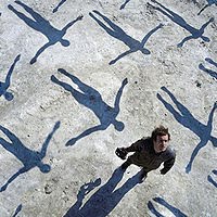
9.      Ashley Barnett – I like the use of the filters to create the appearance of CCTV footage. There is a variety of shots and think that the sound works well with the action on the screen.
10.   Hannah Taylor – The music fits in well with the trailer, the different shots are good although you could use different effects.
11.   Georgia Beazant - I like that it's in black and white, it all fits in with the posters. The choice of song is awesome too. It's really good and works well with how it's been filmed. I also think you should make the colour of the title different. That’s it, it's so good.
12.   Megan Hollingshurst - Its really good and the words that come up fit with the music, the shots of all the people milling around is really good as is the shot of a teacher from across the other side as it shows the whole 'watching' concept really well. The only thing i can think of to improve is to make the 'in cinemas' bit into the same font as the other words to link it in - otherwise it’s really good. 
13.   Scott Hodges - I like the camera shots and the CCTV filter is awesome. The only thing i would say about it is i didn’t know what the title was. Maybe use it at the end. The choice of song is good and there were a couple of repeated shots in there but overall I really liked it.
14. Andrew Baines - There are moments of genius in this Aaron, for example the development of tension driven by the music, the initial accelerated shots of the people walking in the atrium and one or two of the cctv shots - very captivating indeed. However, there are two or three shots which look amateur by comparison - shorten and filter them - build to a climax with faster edits and be ruthless with anything that looks plain or awkward; filter it or get rid of it.

From the feedback I have received, I have learnt that the title is not clear enough within the trailer. The viewers did not know what title of what they were watching was until roughly half way through the trailer. I disagree with those who said this, as I felt that it was clear enough what the title was. The early text I used such as “Think about today”, which is a rhetorical question. “They’re watching you” and “Yet one man takes a stand” are statements or fact.

Furthermore, some of my viewers spoke about the fact that it did not stand out enough, meaning that it could be bigger and have more impact on the viewer to tell them that it is the title. I agree with this and hindsight suggests that this would have been an easy thing to rectify. However, my defence is that I was creating a continuity within the trailer for all the text, the exception being the release date, which is larger as I wanted that to be embedded into the audience so they knew when they could go and watch the film in its entirety.
Some of those who provided me with feedback discussed the Colour schemes and that they could be changed. While accepting their views, I chose the colour schemes to reflect the mood of the film. Also, CCTV is mostly black and white.

I chose to heed Andrew Baines' advice and edit the 3rd sequence of sped up footage. I chose to add another filter and two more effects to vary the look it had. 


EVALUATION : How effective is the combination of your main product and ancillary texts?

Poster


I think that my poster has come out very well. I enjoyed constructing it too. The house in the middle of the eye, which is a photo I took of my friends eye, represents the “Ministries” that are in the George Orwell Novel “1984”. I have tried to keep the poster as “word-free” as possible as to ensure that the eye is the main source of attention.

·         The theme of intrusiveness is beautifully illustrated in the poster. The idea of someone looking deeply into your eye shows a sense of invading ones personal privacy.
·         The poster is fantastic; I really like the image inside the eye. gets the "big brother" point across.
·         On the poster, I think that the "the future is coming bit" should be on the bottom, but otherwise, i really like it.
·         You should have 'the future is coming' bit in a straight line across the top, but yeah it’s wicked :)
·         The bit in the eye is awesome, I think you could put the 'they are always watching' as slightly bigger and so too the film name. Otherwise it’s really good as it hasn’t got too much text to distract from the idea of the film.
·         The Poster is good but the R in ruled gets lost in the white.


Magazine Cover


The magazine cover, which I created on In Design is a piece I am very pleased with. Using my prior knowledge of codes and conventions of magazines and their covers, I used a house style for the magazine but used the same writing on the poster, magazine and trailer for the film  title for continuity and also to create a brand style to some extent. Below is some of the feedback I received for the magazine cover. 

·         With the eye being a non-monochrome colour, it really focuses the audience’s eyes to the cover. The method of using the “Inside” section around the eye serves to help the focussing the audiences eye. However, although the title of the film is clear, it could be larger in size.
·         I like how you've used the black and white, and the eye is blue. This will bring the attention straight to that. So perhaps you should make the title bigger and a bluey/white to bring more attention to that. The writing down the side is good, it's just enough. But it could be slightly bigger and more against the side, if you get what I mean. I like the name of it too and it's obviously been really well thought out.
·         I think you should left align the Smaller text. You have overused Exclamation marks, too many. Also if it’s a Magazine cover does it need to be dated? Ie. It could Be quarterly, such as Spring 2011"
·         I think you should line up the text down the left side and put it all under Inside.
·         The magazine, maybe make the titles more central and also the eye look s a bit too overstretched upwards. 

EVALUATION: In what ways does your media product use, develop or challenge forms and conventions of real media products?


I think that my media product uses and partially challenges the codes and conventions of an action or thriller movie film trailer. I have used fast cuts in the second half of the trailer, to work with the soundtrack, which also uses a convention in trailers of this type as the audience associates high tempo music with fast and furious action on the screen.

My soundtrack challenges the codes and conventions of my chosen genre as it begins slowly and is constant throughout the trailer, building to a crescendo. I feel that my footage, which works with the pace of the music, suits the music and the music with the footage. It took a few attempts at different styles of music to find one that created the atmosphere I wanted. 

After watching a number of trailers, the use of titles and text during the trailer was a common theme. It may seem obvious to put these things in but sometimes an image can tell a great number of things and also leave the audience to their own interpretation of an image. I deliberated with this thought, as I am looking to embed an enigma into the audience’s mind. In the end, my decision was to conform to the codes and convention of using the text within the trailer to help the audience understand and gain an amount of knowledge as to what may be held within the plot of the film itself.

The inclusion of the date of release was something that does not always appear in a trailer. Various trailers use “Coming Soon” or “This Summer”. Others provide a month, without being precise with an exact date. This led me to toy with using a “Coming Soon” or provide an actual date. I chose to provide a date as it would help raise expectancy and excitement levels as the date draws closer. When a big movie is released, everyone wants to know WHEN it will be in cinemas or on DVD. As the date approaches, film fans will gradually get more and more excited about the release of the film. A very good example of this is the Harry Potter series, Star Wars films and The Lord of the Rings Trilogy.

Whilst carrying out my research on Film Trailers, the use of the name of the company who had produced the film was found every time. For this reason, I used the convention and had to include it into mine.

I have conformed to the codes and conventions of Action/Thriller film trailers by using a variety of camera shots. I have at the same time challenged it though by using many longer shots in my CCTV style footage. I have also challenged the codes and conventions through electing to not use dialogue in my trailer. I felt this as it would interrupt the smoothness created by the soundtrack. 

Thursday 31 March 2011

Problems I Have Faced

Throughout the construction of my coursework, I have faced a number of problems. One major problem was the unfamiliarity I had with Final Cut Express. It took me several months to be able to have confidence in using it to create my desired effects.


Also, when burning my trailer to a disc, I experienced a reluctance from the programme I was using, iDVD, to burn the trailer to the disc. 

Finally! My Trailer Has Been Uploaded!

Hi Everyone!


After a hourly wait, where I had to leave my computer running over night, my Film trailer is now Live on YouTube and Facebook.


Im hoping for plenty of online feedback to accompany the feedback I receive through showing people my Trailer.  


Tuesday 29 March 2011

Evaluation

My evaluation of my trailer has begun!


Now that I have completed my trailer and am collecting feedback I am answering the following four questions to evaluate my project.


1. In what ways does your media product use, develop or challenge codes and conventions of real media products.
2. How effective is the combination of your main product and ancillary tasks?
3. What have you learned from your audience feedback?
4. How did you use media technologies in the construction, research and planning and evaluation stages?


I will shortly upload my trailer to this Blog, Facebook and YouTube, as well as posting JPEG images of my ancillary tasks on Facebook and this Blog.. I will use this as a base for people to provide me with feedback as well as showing people and asking for feedback. 

Monday 28 March 2011

Koyaanisqatsi

Koyaanisqatsi

The film consists primarily of slow motion and time-lapse stock footage of cities and many natural landscapes across the United States.
Reggio stated that the Qatsi films are intended to simply create an experience and that "it is up [to] the viewer to take for himself/herself what it is that [the film] means." He also said that "these films have never been about the effect of technology, of industry on people. It's been that everyone: politics, education, things of the financial structure, the nation state structure, language, the culture, religion, all of that exists within the host of technology. So it's not the effect of, it's that everything exists within [technology]. It's not that we use technology, we live technology. Technology has become as ubiquitous as the air we breathe..."[6] The movie no dialogue but does feature the Hopi word koyaanisqatsi, translated as "life of moral corruption and turmoil" or "life out of balance," or "a state of life that calls for another way of living."[11] "Koyaanisqatsi" is chanted at the beginning and end of the film in a dark, sepulchral basso profundo by singer Albert de Ruiter over the score by Philip Glass. Three Hopi prophecies are sung by a choral ensemble during the latter part of the "Prophecies" movement are translated just prior to the end credits:
"If we dig precious things from the land, we will invite disaster."
"Near the day of Purification, there will be cobwebs spun back and forth in the sky."
"A container of ashes might one day be thrown from the sky, which could burn the land and boil the oceans."
The film took about six years to make. Three years were spent shooting the film. Glass and Reggio spent an additional three years in a state of collaboration, with Glass composing score to fit the film and Reggio re-cutting the footage to fit the score.
At the end of the film, the movie credits for inspiration Jacques Ellul, Ivan Illich, David Monongye, Guy Debord and Leopold Kohr. Moreover, amongst the consultants to the director are listed such names as Jeffrey Lew, T.A. Price, Belle Carpenter, Langdon Winner, Cybelle Carpenter and Barbara Pecarich.


This movie features similar elements of footage to that which I have filmed and included in my trailer. 

Thursday 24 March 2011

Poster Research


A-Team Poster

This poster is a very simple poster that grabs your attention. The picture is effective because it allows you to see the characters and the actors who are in the movie.
The tagline at the top of the page helps to attract your attention as it is short and sharp, which sticks in your memory.
The title and release date are also included. 


Hellboy
The Hellboy poster works well as it sets him as the main focus. The tagline, placed under the characters name (and film title), serves as a definitive staement.
The use of a dark background colour mirrors the theme of the film, as a dark and mysterious story.


Publisher Research

PUBLISHER RESEARCH


Bauer Media Group
The Bauer Media Group (Bauer Verlagsgruppe) is a large German publishing company based in Hamburg, which operates in 15 countries worldwide. Since the company was founded in 1875, it has been privately-owned and under management by the Bauer family. It was formerly called Heinrich Bauer Verlag KG, abbreviated to HBV and usually shortened to H. Bauer. Worldwide circulation of Bauer Media Group's magazine titles amounts to 38 million magazines a week.

Empire

Editor
Mark Dinning
First issue
July 1989
Categories
Film
Company
Bauer
Frequency
Monthly
Country
United Kingdom
Circulation
194,016 (2009)
Language
English


Future Publishing
Future plc is a media company; in 2006, it was the sixth-largest in the United Kingdom. It publishes more than 150 magazines in fields such as video games, technology, automotive, cycling, films and photography. Future is the official magazine company of all three major games console manufacturers. It is a constituent of the FTSE Fledgling Index.


Total Film Magazine

Editor
Aubrey Day
First issue
1997
Categories
Film
Company
Future Publishing
Frequency
Monthly
Country
United Kingdom
Circulation
85,031 (2008 average)[
Language
English


I conducted publisher research so I had a familiarity with the publishers of the chosen researched magazines and to also enahnce my knowledge of the media industry as a whole